Getting Started
This feature is available when creating or editing a Pass Template and must be enabled using the following toggle: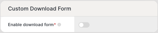
Previewing Your Custom Form
You can preview your form in real time using the preview component while creating or editing a pass template with custom forms enabled. This feature displays the URL, design elements, and form fields for both mobile and desktop browsers.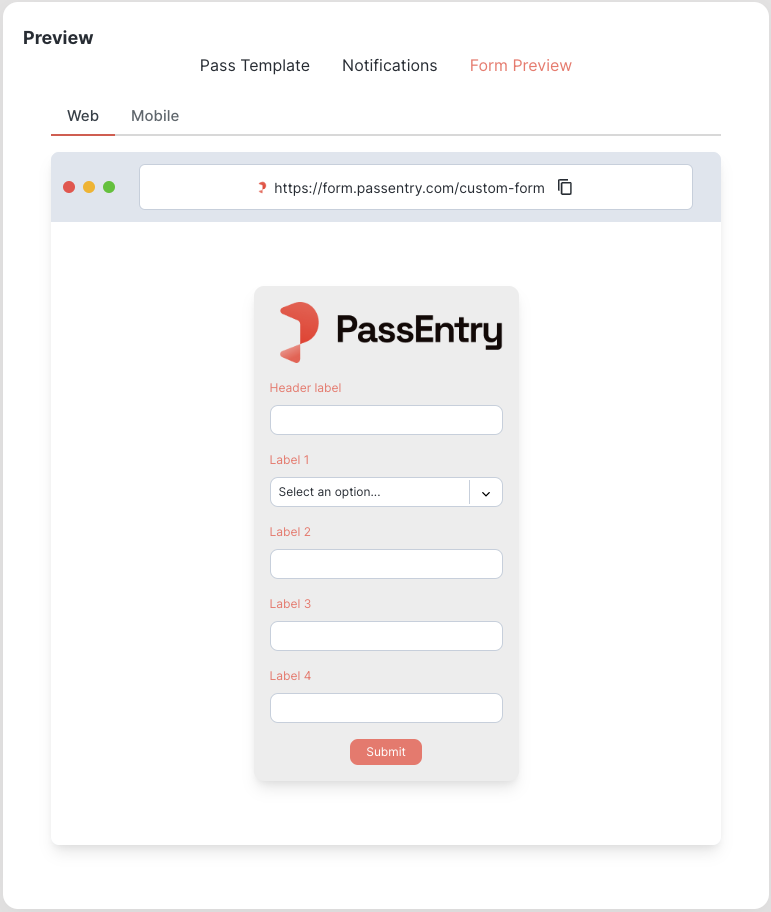
Designing Your Custom Form
Once you enable the custom pass issuance form for your template, you will see several fields that allow you to personalise the form to your needs: Form Name - This is a required field that serves as an identifier for your form. It must be a unique, dash-separated string, as it will be used in the URL when accessing your form once it is live. Header Image - The logo displayed at the top of your form. By default, this will be the logo from the pass template. Favicon Logo - The favicon logo displayed in the browser tab when viewing your form. If not specified, it will default to the icon logo from the pass template. Background Colour - Defines the background colour of your form. Component Fill Colour - Sets the colour of the form components. By default, this will match the pass background colour from the pass template. Font Colour - Determines the colour of the text displayed on your form. By default, this will match the title font colour from the pass template. Button Background Colour - Defines the colour of the button on your form. Button Text Colour - Determines the colour of the text displayed on the button. Button Text - The text displayed on the button.Form fields
These form fields define the structure of your form. Click “Edit” to expand the fields, enabling you to add, remove, reorder, or configure them as needed. When designing a custom form, you can choose between two field types: input and dropdown. Each type includes various sub-fields that can be customised to suit your requirements. By default, the form fields are pre-populated with input fields corresponding to the active fields on your pass template.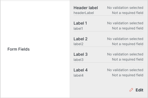
Input Fields
Input fields allow users to enter text or numeric information. The template field, label, and validation rules can be customised to suit your requirements.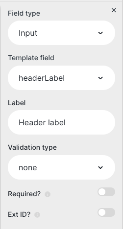
Please enter a valid <form field label>.
For example: 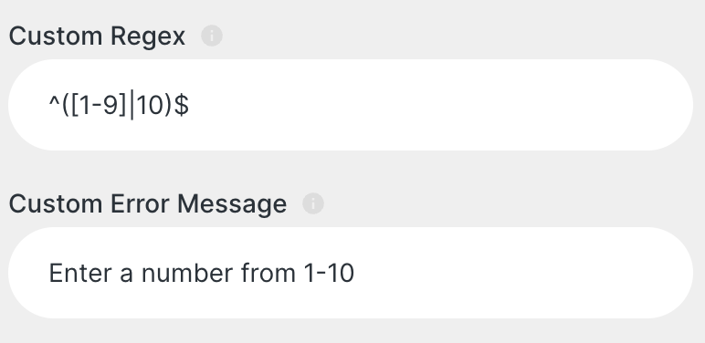
Date Fields
Date fields allow users to enter a date to be applied to their pass with specific date formatting.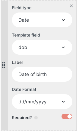
dd/mm/yyyy, yyyy/mm/dd, dd/mm/yy, and Month Day, Year.
Dropdown Fields
Dropdown fields provide a list of options for users to select from.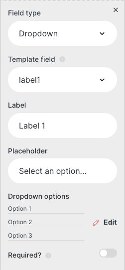
Custom Query Parameters
You can also add custom query parameters to your form. This will allow you to pass in additional data to the form which can be used to populate the pass.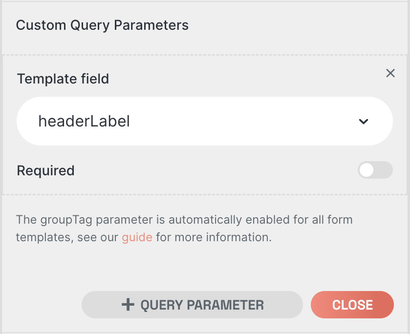
https://form.passentry.com/form-name?label1=value1&label2=value2, which would populate the pass fields with the values for label1 and label2 respectively.
It’s important to note that if you create a custom query parameter for a template field that also has a corresponding form field (See Form fields), the user input provided to the form field will take precedence.
You can also pass the optional groupTag or groupTags parameter to your pass form, which will apply the provided value(s) as group tags to the created pass for segmentation purposes, eg https://form.passentry.com/form-name?groupTag=example-group-tag & https://form.passentry.com/form-name?groupTags=example-group-tag1,example-group-tag2.